Craig Stocks Arts Fine Art Photography and Artwork Duplication Services in Peoria and Central Illinois
This page lists some of my Photoshop and photography techniques. If you've read my blog in the past, you already know that I'm a big fan of Photoshop, and I don't consider the image to be complete until it's been optimized in the digital darkroom. Sometimes, that can be as simple as tweaking the image brightness, contrast or color. Other times, it requires hours of work to achieve the artistic vision that I had in mind when I pressed the shutter release. And sometimes, it's just plain old salvage work that's needed to save a photo.
 |
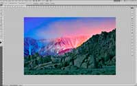
Blending Layers in PhotoshopMany scenes have too much range between the brightest and darkest areas to get a good exposure for both. The result is an image that doesn't look natural, such as a pure white sky or a very dark foreground. This tutorial shows how to take two separate exposures and then blend them together in Photoshop to create an image that looks correct. |
|
 |
Avoiding Color Space Conversion Problems with Lightroom and PhotoshopAdobe Lightroom and Photoshop are great tools for tuning colors in a photo, but there is a hidden gotcha' - color space conversion. Sometimes things look great in Lightroom, but don't look so great when you export a jpeg to post on the web or send to your printer. This tutorial explains why that happens and provides some techniques to avoid the problem. |
|
 |
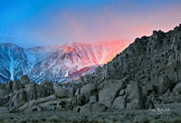
Removing Colored Fringe from Foreground DetailsMany times when we take pictures at sunrise or sunset, we'll see a strong red fringe around foreground details like tree branches and leaves. While it's similar to chromatic aberration, it actually appears to be localized lens flare. Standard CA corrections won't correct, but this Photoshop technique will. |
|
 |
Setting Background Colors in Photoshop and LightroomWhen you're editing a photo, the default gray background in Lightroom or Photoshop can really affect how you see your image. Here's a quick tip to show quick and easy ways to change the color to get a normalized view of your image. |
|
 |
Photoshop Before and After Images and Retouching a Beauty PhotoWhile it's not exactly a tutorial, I've recently put up a page to serve as a portfolio of some of my Photoshop before and after views. It's set up with roll-over images so you can roll your mouse pointer over the image and it will display the before image so you can see the impact of Photoshop processing. I also have another post describing two different approaches to retouching a glamour or beauty photo. Thanks to photographer Cristian Mihai for providing the image. |
|
 |
The Artistic Effects of Color SaturationI'm a big fan of post processing an image to make it the best it can be. Sometimes, you start out with a clear vision of the end result, but other times you play and explore some of the boundaries just to see what you'll find. In this tutorial, I explore the concept of color saturation to see how much is too much. |
|
 |
Add a Digital Frame to your PhotoThis tutorial takes the idea of creating a digital frame one step further by automating the process. You can automate any sequence of steps in Photoshop by recording an action, but that doesn't allow you to vary the inputs. Here, I've created a script that allows you to specify the key dimensions you'd like. I've also included links to the script as well as the layer styles that are needed to produce this effect. |
|
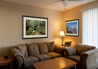 |
Preview Photos Framed and Hanging on a WallAs photographers, we occasionally want to help someone visualize how a photo will look displayed on their own walls. It might be to select the best size, or the right color mat, or even the right photo. This series of video tutorials shows a few different approaches using either Lightroom or Photoshop. There is also a third tutorial showing how to create the digital frame and mat that's used in the example. |
|
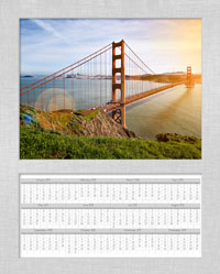 |
Use a Lightroom Identity Plate to Create a Custom Photo FrameLightroom is a great tool, and there are a few tricks to make it even better. I tend to use the Identity Plate feature quite a bit, and not always for its intended use. Here's a way to set up the identity plate to create a matted print. In this example, all of the mat and the calendar are the identity plate. Pretty cool. |
|
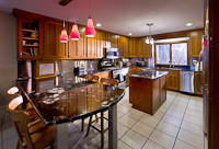 |
Make an Architectural Interior Look Like a Sunny DayIt's not unusual to dabble in architectural photography. In my case, we had just finished a remodeling project and wanted to be sure to capture some before and after photos. This tutorial shares my technique for adding a little extra pizzazz to the "after" photo. |
|
 |
Your Camera's Raw Mode Gives You More FlexibilityDo you enjoy getting the best possible results from your photos? If so, then you should consider setting your camera to shoot in raw mode. Nearly all DSLRs and many high-end point and shoot cameras have that capability. It's a little more work for you, but the payoff is more control over your image and consequently better results. Read my tutorial on raw mode photography to learn more. |
|
 |
How to Enlarge a Graphic Image and Avoid Jagged EdgesThere are lots of different tools and techniques to extract a graphical image from a photo, but you often end up with jagged, pixelated edges. This is an issue particuarly if you need to res-up the image to a larger size. In this video tutorial, I show a trick to turn jagged edges into smooth edges. |
|
 |
Video Showing how Windows Uses Monitor ProfilesColor management is a tricky topic for photographers. The goal of a color managed workflow is to ensure that the colors you see on your monitor will match what comes out of your printer. To accomplish this goal, modern computers provide for device profiles (files ending in .icc or .icm) that describe the color response of each device. Windows PCs have a special challenge though. Windows provides for color management, but doesn't actually perform color management. Instead, it's left up to the individual applications to correctly use the profile. This video tutorial shows how you can determine which applications are correctly displaying colors using your custom profile. If you'd like to try it too, you can download the "bad" profile I used in the video right here <link>. |
|
 |
Balance Strobes with a Bright SkyThese are a few of my favorite things! I love my Pocket Wizard Mini TT1. It lets me cheat my camera's sync speed up to 1/1000th of a second, and even beyond if I'm careful. Click on the thumbnail image to the left to read more. |
|
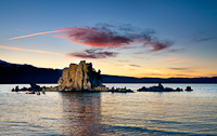 |
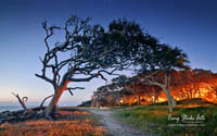
The Story Behind a Striking Photo of Mono LakeThere are a number of interesting aspects to the making of this photo, starting with the use of off-camera flash for a landscape photo. Read the tutorial to find out more about how it was done. |
|
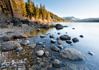 |
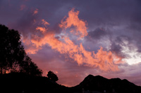
The Right Light Makes All the Difference at Donner LakeAs they say, timing is everything. Sometimes you have to wait for the right light. In this series, I show how dramatically the scene changes in a rather short time period, resulting in a much better result. |
|
 |
Secrets of Green Screen PhotographyHave you been wanting to try green screen photography? Or, maybe you've tried it and found it isn't nearly as easy as you expected. It does take some care, but it's certainly not impossible to get good results. I've just posted a complete tutorial that describes the process, and explains a couple of the tricks to getting a good result. A version of this tutorial is also available on the Wetzel & Company web site. |
|
 |
Craig Stocks' Guide to Basic PhotographyRecently I've had a few occasions to suggest web sites where new photographers could learn more about the art and craft of photography. While I'm aware of numerous intermediate to advanced web sites, I haven't seen a good summary of the basics. That's really a shame, since all of the advanced techniques rely on the basics of camera settings, exposure, lighting and composition. Last year when I was serving as the Artist in Residence at the Organ Pipe Cactus National Monument in Southern Arizona, I put together nearly 100 pages of basic instruction for the rangers and volunteers. I've included here the first 58 pages, which covers basic camera settings and photography. I believe most of the information is understandable just from the information of the slide. Click on the image on the left to view the slides in your Adobe Acrobat. |
|
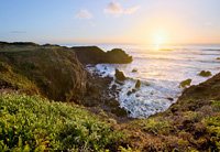 |
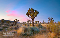
Blending Phtos to Expand your Dynamic RangeA look at using High Dynamic Range (HDR) techniques for a sunset photo from California's Big Sur. Sunsets are especially difficult to capture since the sky is very bright, yet much of the foreground is in a shadow. HDR techniques allow you to bring out the best of both the sky and the foreground. |
|
 |
Quck and Easy Vacation Photo CompositeHave you ever been on vacation and wanted a quick photo of you and your wife or husband? It's actually pretty easy to do it yourself using Photoshop. |
|
 |
Basic Photo Processing in Adobe LightroomSometimes just a little bit of correction goes a long way to improve an image. The example here uses just a few simple adjustments in Lightroom for a dramatic before and after result. |
|
 |
Photoshop Techniques to Remove Chromatic AberrationAlmost all lenses exhibit some amount of chromatic aberration... it's just the nature and physics of light. Fortunately it's not noticeable in most images. But sometimes, it becomes very pronounced and can dramatically alter the feel of a photo. This example shows how to use Photoshop to remove an excessive amount of chromatic aberration. |
|
 |
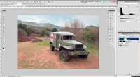
How Photoshop Saved the DaySometimes a simple problem is very difficult to fix. In this example, the gray design had to be removed from the black t-shirt in order for the image to be accepted by iStockphoto. It sounds easy, but it's actually rather difficult when the result has to be completely undetectable in a high resolution close-up. This write-up was one of seven weekly winners in the Layers Magazine / Adobe Systems How Photoshop CS4 Saved the Day contest. |
|