| Click here to tell a friend about this web page!
This page highlights some of my Photoshop before and after techniques. If you've read my blog in the past, you already know that I'm a big fan of Photoshop, and I don't consider the image to be complete until it's been optimized in the digital darkroom. Sometimes, that can be as simple as tweaking the image brightness, contrast or color. Other times, it requires hours of work to achieve the artistic vision that I had in mind when I pressed the shutter release. And sometimes, it's just plain old salvage work that's needed to save a photo.
January 26, 2010
If you follow photography you've probably heard about HDR. Hight Dynamic Range (HDR) photography is all about capturing the full range of light and dark that occurs in real life, but is beyond what a digital sensor (or film for that matter) can capture. Our eyes and brains are very good at compensating for drastic differences in bright and dark areas. Have you ever sat in a dark room and looked out a window into bright sunlight? Your eyes can see detail in the dark room, and details in the bright sunlight.
Unfortunately, cameras aren't nearly as adaptable. If you try to take a picture of that scene, you'll be limited by the camera's dynamic range, which is the total range of darkest to brightest values it can record. You basically have three choices, expose for the dark areas and let the bright areas turn completely white. Or, expose for the bright areas and let the dark areas become completely black. The third option is to try for the middle, but the bright areas will be too bright and the dark areas will be too dark.
High Dynamic Range photgraphy attempts to compress all of the tones so that they will reproduce as we see them. Whether the final output is to a computer monitor or a printed photograph, the picture can't display anything brighter than white, or darker than black.
The image below is an example of a situation where the range from the bright sun to the dark shadows was well beyond what could be captured or displayed. (Roll your mouse pointer over the image to see one of the original frames.) My eyes were able to see the entire scene, but it takes special techniques to reproduce all of the tones in a single photograph.
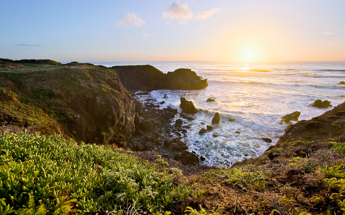
The biggest challenge with HDR processes is to compress the tones yet still have an image that looks natural. There are a number of approaches, but all of them involve capturing more than one image. Generally, you try to get at least one exposed for the brightest areas and one exposed for the darkest areas.
In this case, I actually used four layers. The base image was an exposure for the grassy areas and the rocks. A second layer was for the water, and a third was for the sky and sun. I then created a fourth layer just for the smooth transition from the bright center of the sun to the orange glow that surrounds it..
By carefully masking and combining the four layers in Photoshop, I was able to produce the final image. That's the view I saw from the cliff, but the camera just couldn't capture it all in one exposure. Thankfully, the modern techniques of the digital darkroom let us capture what we can see with our eyes so we're not limited to capturing just what a camera can see.
December 19, 2009
This example is a technique we use frequently when we're out hiking or being tourists. Frequently, there isn't anyone around to take our picture, and even if there were, I'd be reluctant to hand them my camera. (I've seen too many cameras bounce off the ground when being passed!) If I have a tripod along, it's easy. Otherwise, we do a quick composite from two photos.
This example was taken on Martha's Vineyard in October 2009. (You may recognize it from our Christmas Card.) Being October, we were the only brave souls to walk out onto the beach with the lighthouse, and I was travelling light, so no tripod. No problem...
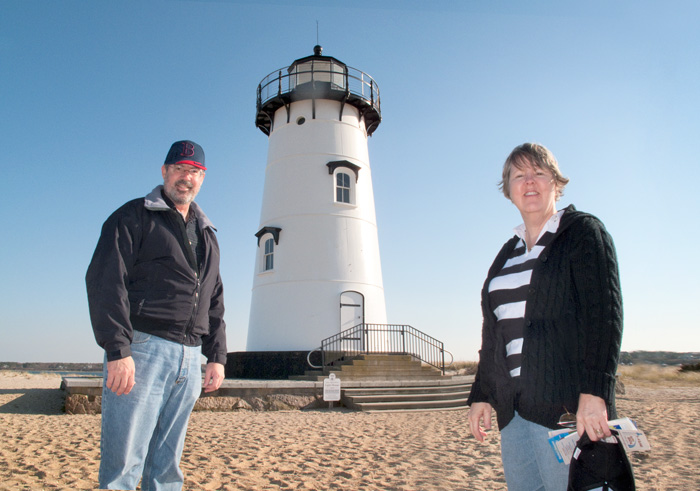
Roll your mouse pointer over the photo below to see the two photos that were used to make the final composite. The process is simple, First, I position Deb and take a picture of her, leaving enough room in the frame to add myself. Then, Deb comes and stands exactly where I was standing and takes a picture of me. That gives me two images with roughly the same background composition. It also helps to set the camera's exposure to manual so that the two images have exactly the same density.
Then, I load both images into Photoshop as separate layers, so that one image is over the top of the other. Since the backgrounds aren't exactly the same, I need to align the layers, using Photoshop's Auto-Align feature, or manually. In this example, you'll notice some areas on my picture where the edges don't line up, but the horizon and lighthouse are very close.
Once the layers are aligned, I simply add a layer mask to the top image to hide the portion where I want to see through to the bottom image. In this case, I "painted away" the beach and sky to the left of the lighthouse to reveal myself on the lower layer. Like magic, we're both in the picture.
This photo also had some further retouching work. I extended the background a little on the right to balance the composition, and removed Deb's purse so that it wasn't a distraction.
All in all, it's a quick process, and we use it quite a bit. In fact, both photos on our 2009 Christmas card were done this way.
October 27, 2009
Enhancing a Twilight Photo of Boston in the Fall
This example was done entirely in LIghtroom rather than Photoshop. Lightroom's full name is "Adobe Photoshop LIghtroom" which indicates that it is intended as a companion product. Of course, Adobe wants us to buy both Lightroom and Photoshop, but the two programs have different strengths. Photoshop is good for heavy-duty retouching, such as replacing skys in a landscape, swapping heads in a group portrait, or doing extensive portrait retouching. Lightroom is great at managing images from an entire shoot, such as a wedding, but it has only the basic processing tools. In terms of function, it's a combination of Bridge and Adobe Camera Raw (if you use Photoshop, you'll know what that means).
The photo below was taken from a park overlook in Waltham, looking east toward Cambridge and Boston. The sun was just setting behind us, and the building and street lights wre all coming on. The fall colors were in full bloom, and nearly every tree in sight was a bright yellow or red. Their color is accented by the red glow from the setting sun. I love the color contrast between the orange foilage and the blue sky.

Roll you mouse pointer over the image to see the original version. Since the lighting was very low and flat, the scene didn't have much contrast. In fact, there aren't any whites or blacks in the scene, just mid-tones. The colors are also pretty flat, again because of the low light level.
Fortunately, Lightroom is good at those kind of adjustments. The first step is to increase the Exposure setting, which mostly brightens the bright parts of the scene. Then, increase the Black setting, which pulls the dark tones back toward black. That gives the scene some overall contrast, and pop, but I also increased the contrast some more using the Contrast slider and the Tone Curve. Then, I increased both Vibrance and Saturation to make the colors pop.
The last major adjustment was to add a gradient to the sky. The gradient darkened the sky, increased the contrast and saturation, and added some blue.
I think the end result is a much better representation of what my eyes and mind saw. Our minds do a lot of visual interpretation that we're not even aware of, but cameras are simple machines. They record the photons as they actually appear. It's up to the artist to determine how they want to represent the scene.
Back to my Blog
September 28, 2009
Retouching Eyes in a Portrait
Whoever first said that the eyes are the window to the soul must have been a portrait artist. They are one of the most important elements to get right. In fact, photographers frequently choose lighting specifically because of the way it lights the eyes, or the way it's reflected in the eyes. A large, rectangular light source will create a large catch light in eyes, which is much more attractive than a small pin-point of light. It also creates the look of a window reflected in the eyes, so it enhances the impression of natural window light.
With Photoshop, you can adjust some of those elements after the fact. In the example below, I didn't have a large softbox to create beautiful catch lights, and the eyes are a little too dark. You can spend quite a bit of time creating perfect eyes. In fact, you have to be careful that they aren't too perfect, or they won't look natural. You're not trying to fix your subject, you just want to enhance the natural beauty that's already there.
Roll your mouse pointer on and off the photo below to see the before version.
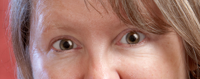
The steps here are pretty standard eye retouching. The first step is to do any cleanup using the clone stamp on a new layer. In this case, I removed some small vein lines in the whites, and also removed the original catch lights. (I'll create new catch lights later.) The next step was to lighten the entire eye socket area for each eye by painting with white on a new layer in Softlight blending mode. I also used that same technique to add some additional lightness to the whites of the eyes. The last change for the whites was to remove any remaining redness by adding a Hue/Saturation layer to reduce the saturation of red colors, and then add a layer mask to limit the effect to the eyes.
The next step is to work on the iris and pupil. I increased the color saturation of the iris by adding another Hue/Saturation layer. To create an outline around the iris, I added a Softlight layer and used a very small brush to paint around the outside edge of the iris. In this case, the pupil was already large and dark, so it didn't need any additional work.
The next step is to add a new catch light You can find, buy or make custom brushes for catch lights. In this case, I simply created a catch light shaped selection for each eye and filled it with white on a new layer in Screen blending mode. The last step with the iris is to add the half-moon glow opposite the catch light, this time on a new layer in Softlight blending mode.
As a final touch, I added a Brightness/Contrast layer and layer mask to increase the contrast of just the eyes.
In the end, I added eight new layers. I always like to keep each change on its own layer, so that I can easily go back to fine tune just that effect.
Like most tasks in Photoshop, it takes some time to do it right, but, I think the end result is worth it.
Back to my Blog
September 15, 2009
Fixing Severe Chromatic Aberrations
This is a night photo of downtown Phoenix, Arizona taken from the hills in the North Mountain Park area. The starting image is pretty good, but there are two areas that need improved. The most noticeable issue is the sky. I positioned myself along this trail and took a series of exposures over a 45 minute period. The peak of the colors in the sky was about 30 minutes before the peak of the city lights, so I wanted to blend the two exposures together to get the best sky with the best of the city lights.
The second issue is chromatic aberrations around the lights. The point sources of bright light are all are suffering from intense red-green chromatic aberration (CA) which caused a dark red halo around each light. For images intended for stock sales, such as through iStockphoto, that would have to be fixed.
(Chromatic aberration is a lens focusing defect, or aberration, where different colors of light don't focus correctly. Ideally, all colors (wavelengths) of light should focus to exactly the same point on the surface of the film or digital sensor. Chromatic aberrations occur when the different wavelengths of light focus to slightly different distances which creates colored halos along sharp edges between bright and dark areas.)

The fix, thanks to Photoshop CS4. Roll your mouse pointer on and off the image above to see the before version. You can also click on the photo to see a larger version.
The first issue to deal with was the CA. If that isn't fixed, the rest doesn't matter. Normally, you can get pretty good results using the CA correction tools on the raw image in either Lightroom or Adobe Camera Raw. Alternatively you can also use the lens correction filter in Photoshop to correct CA. They tend to work by adjusting the red and green channels along strong edges, fixing red on one side and green on the other. In this case, none of those would work since the CA completely surrounded each light source.
The solution in this case was to create a Hue-Saturation adjustment layer and focus the adjustment on just the pure red that was mostly in just the CA. I could then reduce the red saturation, and adjust the hue of the red so that it appeared yellow. That allowed the CA to match the color of the light it surrounded. Since there were places where the red was actually the color of the subject, I then needed to add a layer mask to localize the CA correction to just the areas around the lights. It was a little tedious, but not terribly so, and I was done in a few minutes. In this case, I actually needed two separate Hue-Saturation adjustment layers, and just a little bit of cleanup with the clone stamp tool.
The second step was pretty straightforward. I placed the frame with the best sky as a Smart Object layer and added a layer mask so that the final image is made up of the best of both.
The end result has been one of my best selling photos on both iStockphoto and Shutterstock.
Back to my Blog
September 9, 2009
 Saving a photo for iStockphoto Saving a photo for iStockphoto
This post was a winning entry in Adobe's "How Photoshop Saved the Day" contest.
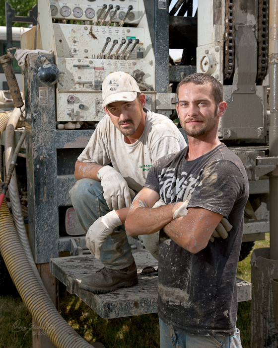
This example is one of salvaging a photo. On the surface, it looks like an easy fix, but it's actually very challenging when the end result needs to be completely believable.
I wanted to get started doing stock photography, and this was one of my first photo shoots expressly for that purpose. The subjects here are my son Chris (on the left) and his friend and co-worker Danny, standing by the rig they use to drill wells for geothermal heating and cooling.
I'd read through the material on iStockphoto, so I was aware of the requirements. Basically, the photo can't include any copyrighted material, and the most common problem is company logos, but you also have to be careful with signs and symbols.
I thought I had taken care of those issues, but the inspectors at iStockphoto are very good at their jobs, meaning that they can find even tiny problems. In this case though, the problem wasn't so tiny. The design on Danny's T-shirt constituted an artistic design, and had to be removed. Oops!
Well, those inspectors are also very good at spotting clumsy Photoshop work. It's pretty easy to retouch a photo like this so that it looks good as a small web browser image. But, iStockphoto's inspectors go over the full-size image magnified to 100%, so they would quickly spot sloppy work. In fact, I nearly just gave up without trying.
(Roll your mouse pointer on and off the photo above to see the "after" version of the photo. Click on the image to see a large version in a new browser window.)
The challenge here is to remove the design without removing the texture. Simply using the clone stamp tool would never work.
Photoshop CS4 to the rescue! I realized that the pattern was mostly color and tone, but it had the same texture as the rest of the shirt. What I needed was to make the pattern the same color as the shirt without changing the texture. What I needed was a curves adjustment.
I started by selecting Danny's chest area and then used Select / Color Range to focus the selection on just the gray pattern. Then, using that selection as a layer mask, I created a curves adjustment layer to darken the pattern. That, in itself, did 90% of the job. Most of the design then just blended into the shirt, but the edges, mud spots and wrinkles needed some finishing touches.
The next step was the clone stamp tool, but now I only needed to clean up the rough edges that the curves adjustment didn't get. I also cloned some additional mud spots to help hide the changes. Next, a little selective lightening and darkening (using a layer in Soft Light blending mode) to put back the contours that had been lost.
The next challenge was to recreate the vertical wrinkle in his shirt. A wrinkle in a shirt is mostly just light and dark graduations, so I added a new layer again in Soft Light blending mode and created a layer mask in the shape of the wrinkle. Then I simply painted the light and shadow using a combination of the gradient and brush tools.
At this point, it looked good from a distance, but at 100% magnification, I'd lost most of the T-shirt fabric texture. The last step was to add a noise layer (again using Soft Light blending mode) and selectively paint noise onto the image using the layer mask to simulate the T-shirt texture. As an added feature with Photoshop CS3 or later, you can convert this layer and apply the noise as a Smart Filter so that the amount can be adjusted later if needed.
When it was all done, I was surprised at how easily I had pulled it off. Roll your mouse over the image to see the before and after, or click on the photo to see a larger copy. You can also see it online here at iStockphoto.
Back to my Blog
|